A pretty nifty progression- even if I didn't get what I wanted out of it (exactly).
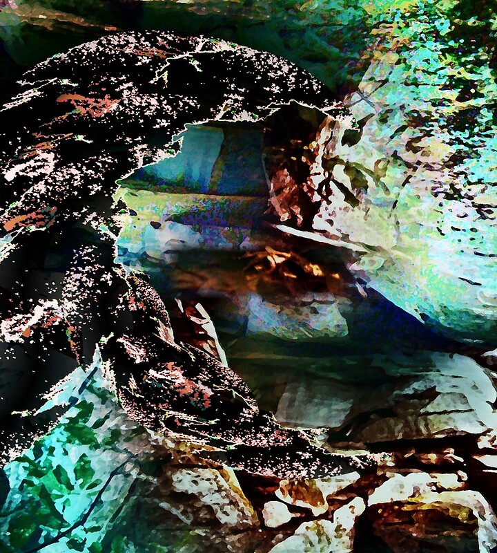
First I began with a picture I took of the base of a huge waterfall in North Carolina...
Then the mixing began. First I tweeked the contrast a bit and up-ed the red hues...
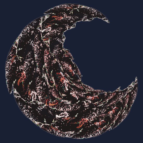
Then I overlaid a bluer layer which was rotated 180 degrees. I could have flipped the image either vertically or horizontally to overlay it but that will always create a line of symmetry in the piece, which is super neat (check out this piece-
Crazy Monkey Faced Vision at 1am) but not what I wanted for this particular piece.
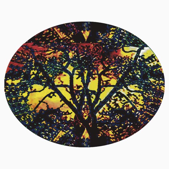
To create...
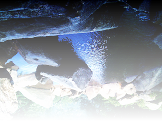
This is one of my favorite images to come out of this progression.
Next I rotated the image 90 degrees.
Then I duplicated the image in a new layer and tweeked the contrast balance and brightness/darkness.
This enhanced layer I overlaid on the original image with some areas made transparent. This helps I've found to add depth to the image, and helps to keep the randomness growing. The randomness is where the good stuff comes from. Anyway, back to the point. This over lay step creates...
The next step was to duplicate this image over itself again. Next I tweeked the color saturation and increased the blue greens. This image I made semi-transparent as well.
With this layer overlaid it created...
The next overlaid semitransparent layer had the sharpness adjusted as well as the contrast.
Overlaid to create...
Next I adjusted the dimensions...
Then I kind of played around the next step involved several different small layers overlaid semi-transparently over the last image. I most just duplicated the parts I liked the most and replicated them within the image. These were the layers...
Arranged on the last image they created...
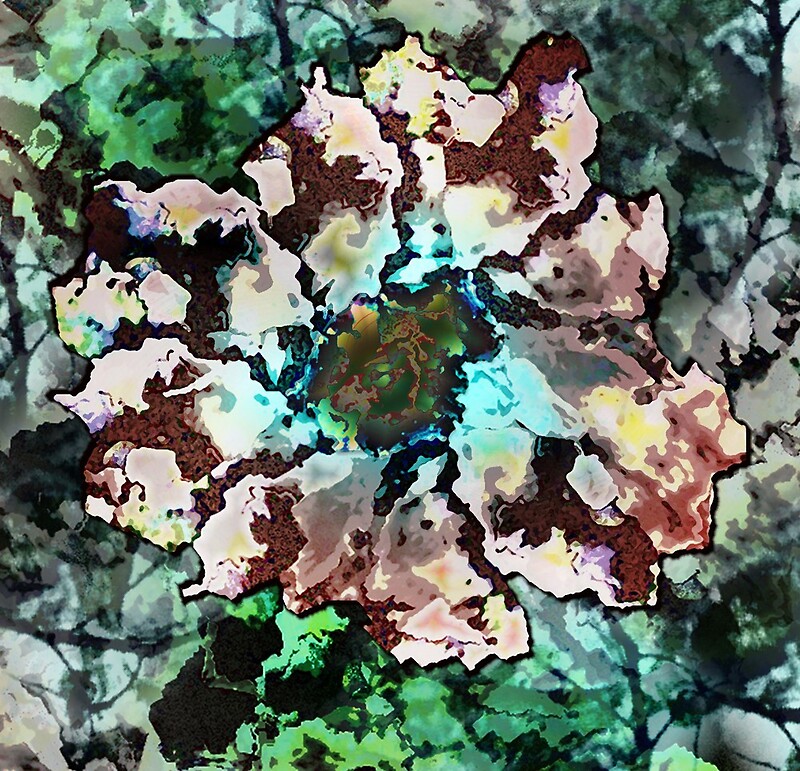
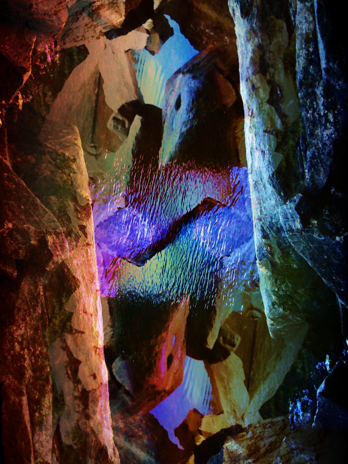
Obviously I liked the watery section. I did a little rotating to take a better look...
This is a pretty interesting image. I could definitely stare at it for a while. But... I kept going... to see what would happen.
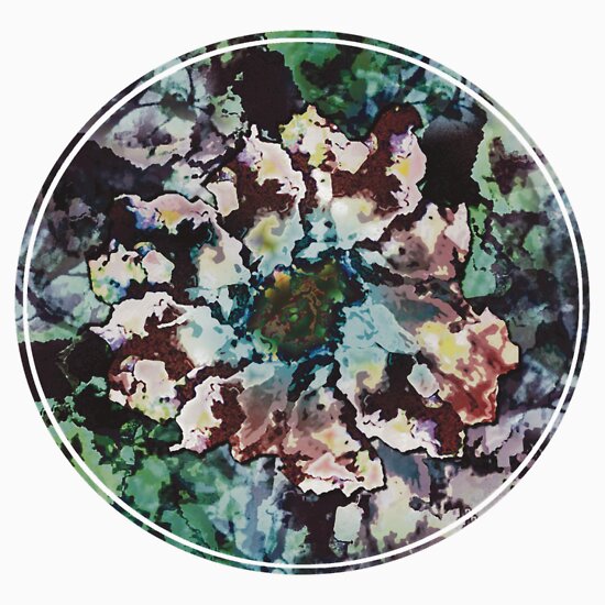
So I cut out the watery part I liked so much.
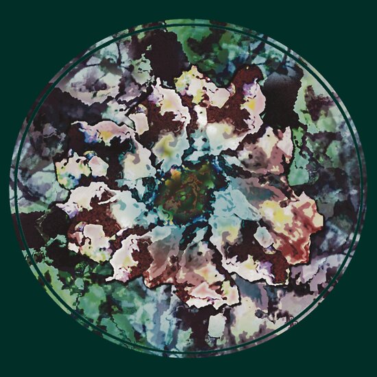
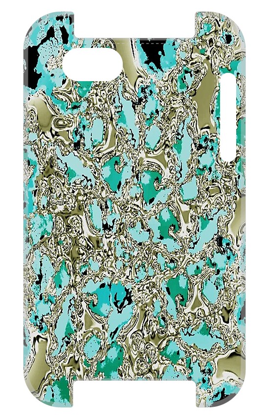
Pretty nifty. I overlaid a duplicate image over it that I had increased the color saturation on...
To get...
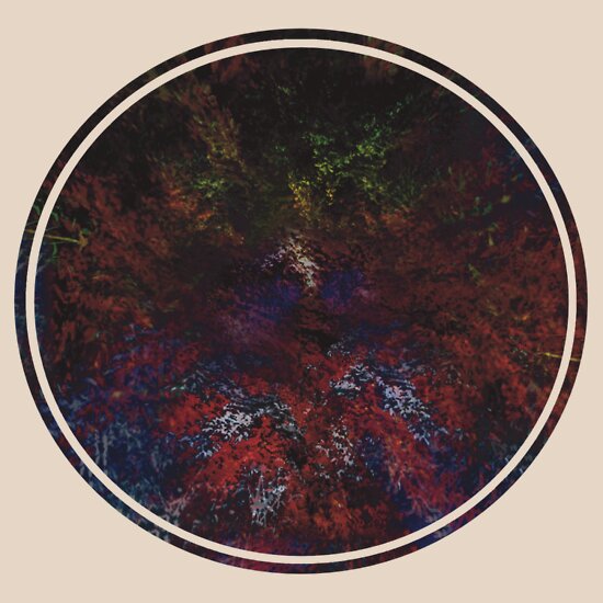
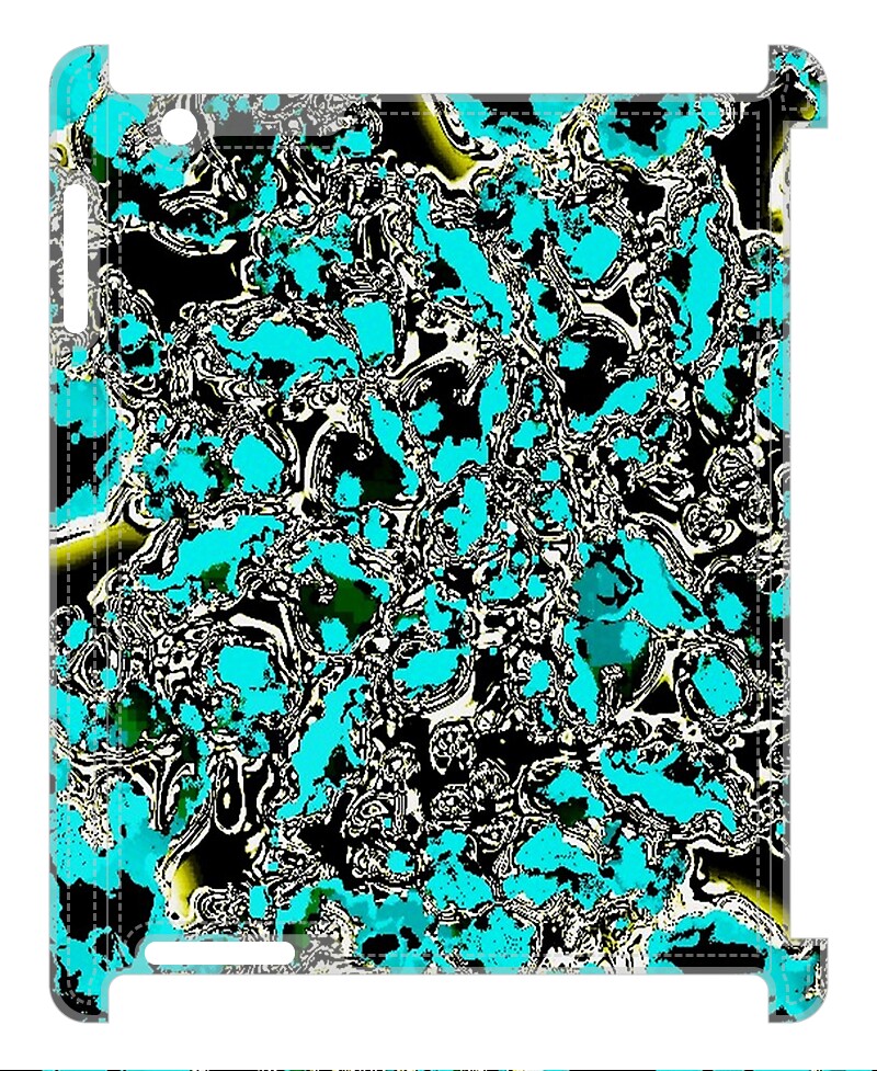
I wasn't sure what exactly I was looking for. So I adjusted the dimensions again...
And overlaid another layer to intensify the bottom and add some depth. The layer...
Creating...
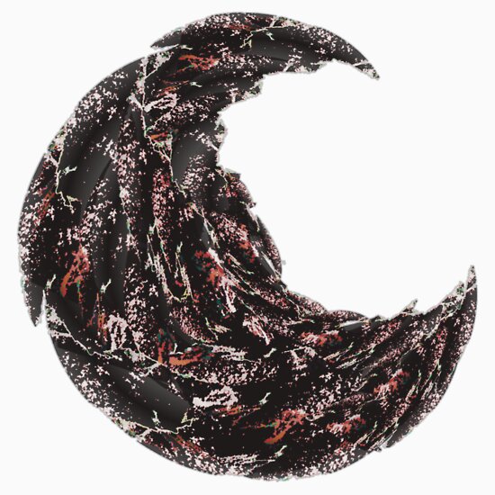
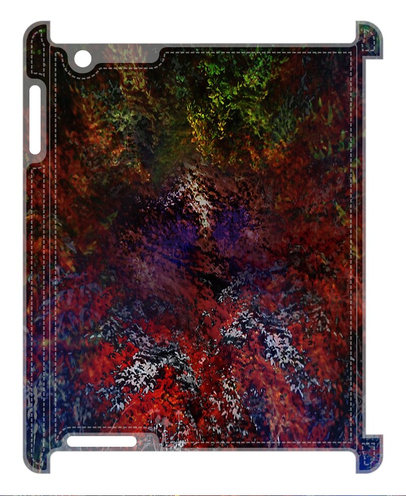
But I wasn't done yet...
Add this layer and you get...
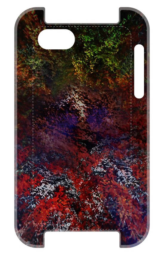
If you rotate this...
And add...
It creates...
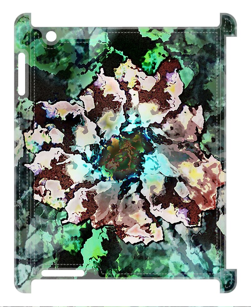
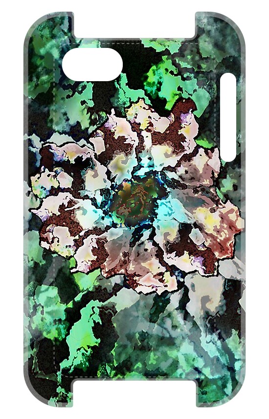
I stopped there. I didn't get exactly what I wanted, but it was a very interesting process. I hoped my explanation was useful or at least entertaining :)